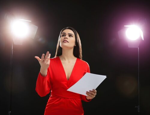
We humans are powerfully influenced by color. There are of course the associations we develop with specific colors, thanks to our culture. Red can mean good fortune, or something hazardous. White can be the color of death, or purity. And then there are moments that depend on color, like the emotional charge we get from a blue sky (without a cloud) or a spectacular sunset – of oranges, reds, and gold, gradually turning into blue, then indigo, and then finally black. By the time we are adults, we humans have a rich set of symbolic meanings that we attach to various colors. Green may be the color of money, or the environment. And so on.
Given that color is so important to us, it’s surprising that we don’t spend more time thinking about what colors we connect with our speeches. What’s your thought leadership color palette, and how does it show up in your speeches?
If we do think about this issue, it’s mostly a design challenge for our slides, or our speaker website, or, if we’re really firing on all speaking cylinders, our overall look, the design palette we use to express our brand in all the various ways it shows up.
And yet, colors have an effect on our psyches, and given that audiences are looking to speakers to provide a top-notch experience for them, it might make sense to pay more attention to how the colors we use make our audiences feel.
A quick review of the research yields up the following insights.
- Blue light relaxes people three times as fast as white light
- Pale colors help learners relax more than bright colors
- Blue, green, and purple colors reduce heart rate more than yellow and red
- Pink walls and lighting in prisons help reduce aggression
This last insight has always been my favorite color-related finding. Paint the walls pink in a prison and you’ll have fewer riots. Why aren’t all prisons painted pink? If you’re afraid of your audience getting feisty, perhaps your slides should be a delicate shade of pastel pink!
But looking for a pattern in these findings is tricky – why does red not reduce your heart rate as much as blue, and yet pink curtails aggression more than other colors?
So you have to think carefully about the effect you want to have on your audience, and then pick the colors appropriate to the emotional underpinnings of your message. In general, it seems that paler colors are more soothing, with pale blue perhaps being the most relaxing. If you’ve got bad news to deliver to your audience, then, perhaps blue tones are the best. Accountants take note for discussing annual tax bills!
But if you’re trying to keep your audience stimulated and entertained, bright colors might be best, with an emphasis on yellow and red. If you’re a trainer who works with an audience for a half-day or a day, then you might think about a progression of colors. Try relaxing shades when you’re attempting to ease an audience into the beginning of the day, perhaps, and peppy colors when you’re trying to help them through that long stretch post lunch when the energy is low, and all the audience’s blood is in their stomachs.
We speakers, if we think about color at all, usually turn our branding and slide-making decisions over to a designer, which may mean we get the color of the fashion moment, or a favorite shade of the artiste’s. But it might behoove us to think more deeply about the psychological effects of color on our audiences, in order to take advantage of mood-setting color design.
What color is your speech?


I don’t know if it’s the color of my speech so much as the color of what I hope is my persona, whimsy. Which is, of course, periwinkle. :)
And nobody looks better in periwinkle than you! Thanks, Maureen!